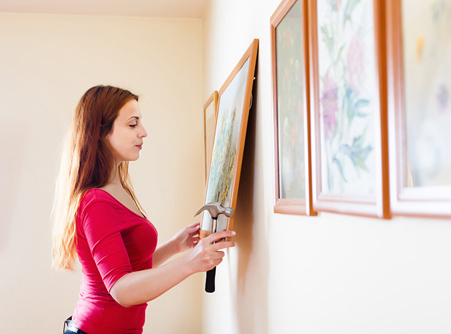
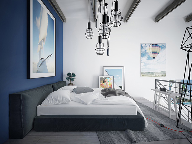
Anyone who has tried their hand at decorating a room knows that choosing the ‛stuff’ that goes into the room is actually the fun, easy part. The hard part is deciding how that ‛stuff’ gets arranged. Furniture layouts, accessory placement, and, of course, your canvas art all need to be placed carefully and with your overall design plan in mind.

Choosing how to arrange the canvas prints online you’ve ordered can be one of the biggest challenges, as it’s often difficult to conceptualise how they’ll look in the room before you actually have them in hand. Lucky for you, there are a few simple guidelines you can follow that can assure that you end up with cool, interesting arrangements of art prints that complement and help define your space.
Wall Art Decor Tip #1: Let the Wall be Your Guide
The most fundamental rule about hanging canvas art on your walls is to let the size and shape of the wall be your ultimate guide. You’re not going to get a huge, horizontally-oriented piece onto a small vertical space, and you’re not going to have much impact with a single small canvas on a huge wall in a room with soaring ceilings. Before you select any art, consider your wall as if it was a canvas itself. Cut a piece of paper or cardboard into its approximate shape, mark the windows and mouldings, and then play around with scraps of paper that represent your eventual art pieces. Find a cool layout that works with the wall, then seek out wall art that matches up with your new vision.
Canvas Art Tip #2: Don’t Get Caught in the ‘Eye Level’ Trap
One of the ‘rules’ of hanging wall pictures is supposedly that all your artwork should be at ‘eye level’ so people don’t have to bend or stretch to see it. This is a pretty good guideline – but notice the term guideline isn’t the same things as a rule. You can play with this, if you want to, and often achieve some amazing effects.

The best ways to play around here is to Go Big and have your art works cover the whole wall, from floor to ceiling. This gives you a balanced look with a big impact that violates this guideline in a cool way. But you can get away with plenty of other layouts that go against this guideline – don’t be afraid to experiment. You can always change it later.
Wall Pictures Tip #3: Don’t Fear the White Space
Finally, one of the most common mistakes people make that actually generates a lot of unnecessary stress is the assumption that ‘empty space’ on a wall is a terrible thing. They go crazy trying to fill the wall space with art, and wind up with a crowded, dense arrangement that stresses out their guests just as much.
Walls in your room are like pages in a magazine: White Space has its role. Empty space between your art installations can be just as powerful a tool as the art works themselves – use it thoughtfully, but don’t feel the need to fill every inch with canvas art. Got it? Then grab your photos and click here to begin your home decorating adventure.


Leave a Reply