Design always starts off seeming pretty easy. After all, you know what you like; you might not be able to charge strangers a lot of money for your design ideas, but you can certainly put together a room for yourself! Except, most of us discover after our initial attempts to design our own spaces that we’re not nearly as good at it as we thought we would be. And the number one thing newcomers to the design world struggle with? The colour palette.

Choosing colour isn’t as simple as picking your favourite ones and throwing them together. There is a complex theory about colour that professional designers spend years studying and playing with, coming to learn techniques that allow them to create sophisticated spaces that have a distinct and purposeful feel to them. But you don’t need to get your degree in colour theory, you just need a few basic tips.
Colour 101
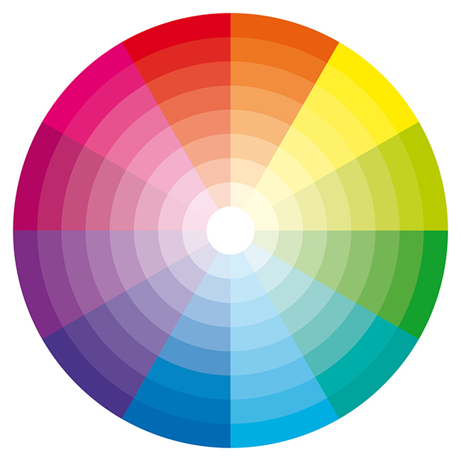
Colours work together naturally, and can create any sort of perceived mood or design tone depending on your choices. The most basic concept to understand is that of Primary, Secondary, and Tertiary colours:
- Primary colours are the fundamental trio: Red, yellow, blue. All other colours stem from these.
- Secondary colours are created by combining primaries. For example, green is a combination of yellow and blue.
- Tertiary colours are further refinements, combining a primary and secondary colour.
Primary colours are very strong but lack sophistication, the further down the road towards tertiary colours the less powerful they become, but the easier to mix and match.
Hot and Cold
The most important thing to know about your colour palette is whether it’s hot or cold. Choosing a colour palette involves settling on a main colour choice and then adopting one of two basic strategies: Finding complementary (contrasting) colours, or finding analogous (similar) colours. On a traditional colour wheel, complementary colours are across from each other and analogous colours are adjacent.

The traditional colour wheel is also split between cold and hot colours, and this is the most basic decision you can make. Once you’ve determined whether your room will be hot or cold, choose a main colour (say, red for a hot room, or blue for a cold room). From there, the other colour choices that will flesh out your palette will come easily simply by looking at the opposite or adjacent colour choices you have.
Colour theory can be incredibly complex, of course, and this is just the smallest introduction to it. But by using these basic concepts you’ll be able to create a colour scheme for any room that has a firm backing of theory behind it, which will allow you to explore your own colour sense successfully and grow as a designer. You can even use colour theory to choose the wall art that will go in the room – click here and let us help you choose.

